KL
System / Live
Design system
Every token and component on this page is read from the code that builds the site. Add a token and it appears here.
Components / Text
Labels are small mono. Big serif type is only for page titles, card titles and numbers.
Label
Label row
Link ↗NowKlink Enterprise SolutionsHairline row: label, serif title, muted text.
LinkedHairline row with linkHover turns the row to the surface colour.Components / Controls
Buttons, chips and the segmented filter.
DefaultStatusAction ↗
Components / Covers
Glyph covers and the four product mockups. Mockups tilt and straighten on hover.
Components / Card grid
One grid for Work, Resources and Blog. First card full width, pairs, a 12px gutter and 112px spacer bands.
BKK
Bangkok Design System
Custom shadcn registry, built as a living case study
LiveWeb, custom shadcn registry
24
Z
Zed, a dual-subtitle player
English and Burmese subtitles, in development
In developmentChrome extension for YouTube
LP
ZM
MM
T1
Components / Compact grid
Resources and Blog use 260px covers and a partner cell for an odd last card.
CRS
AI-Native Design Systems: Beyond Handoff
Build a design system that both designers and AI agents can use.
CourseOpenAsk about the next class ↗
CRS
Figma Design Systems
Hands-on lessons using Klink V3 as a real production example.
CourseOpenAsk about the next class ↗
TLK
Into the AI Ocean: Scaling Design Systems with AI
How to keep a system consistent when AI writes a big part of your UI.
Talk at UXmmSession 3Request the slides ↗
TPL
CLAUDE.md starter for designers
The project rules I give Claude Code before it touches a screen.
TemplateComing soon
TPL
Design system skill file pack
Skill files for color, type, layout and components, ready to adapt.
TemplateComing soon
TOOL
Bangkok Design System
A code-first design system with a custom shadcn registry.
ToolLiveOpen the site ↗
TOOL
shadcn Figma design system
A Figma library that matches shadcn/ui, one to one with code.
Figma kitIn progress
TOOL
This site's design system
Every token and component behind this portfolio, documented live.
Design systemLiveExplore the system ↗
TOOL
TOOL
Burmese subtitles for Stremio
An addon that finds and translates subtitles into Burmese.
Side buildPersonal
Components / Grids
Shared-border grids: numbers, steps and the logo wall.
- 8+
- Years in product design
- 10
- Brands worked with
- 3
- Industries: fintech, SaaS, AI
- 0→1
- Where I do my best work
- 01Frame
Shape flows in Figma, grayscale first. Color only where it means something.
- 02Encode
Turn decisions into tokens, skill files and CLAUDE.md rules.
- 03Build
Generate real components with shadcn/ui and Next.js through Figma MCP.
- 04Ship
Deploy, measure, and feed what we learn back into the system.










Components / Poster and quote
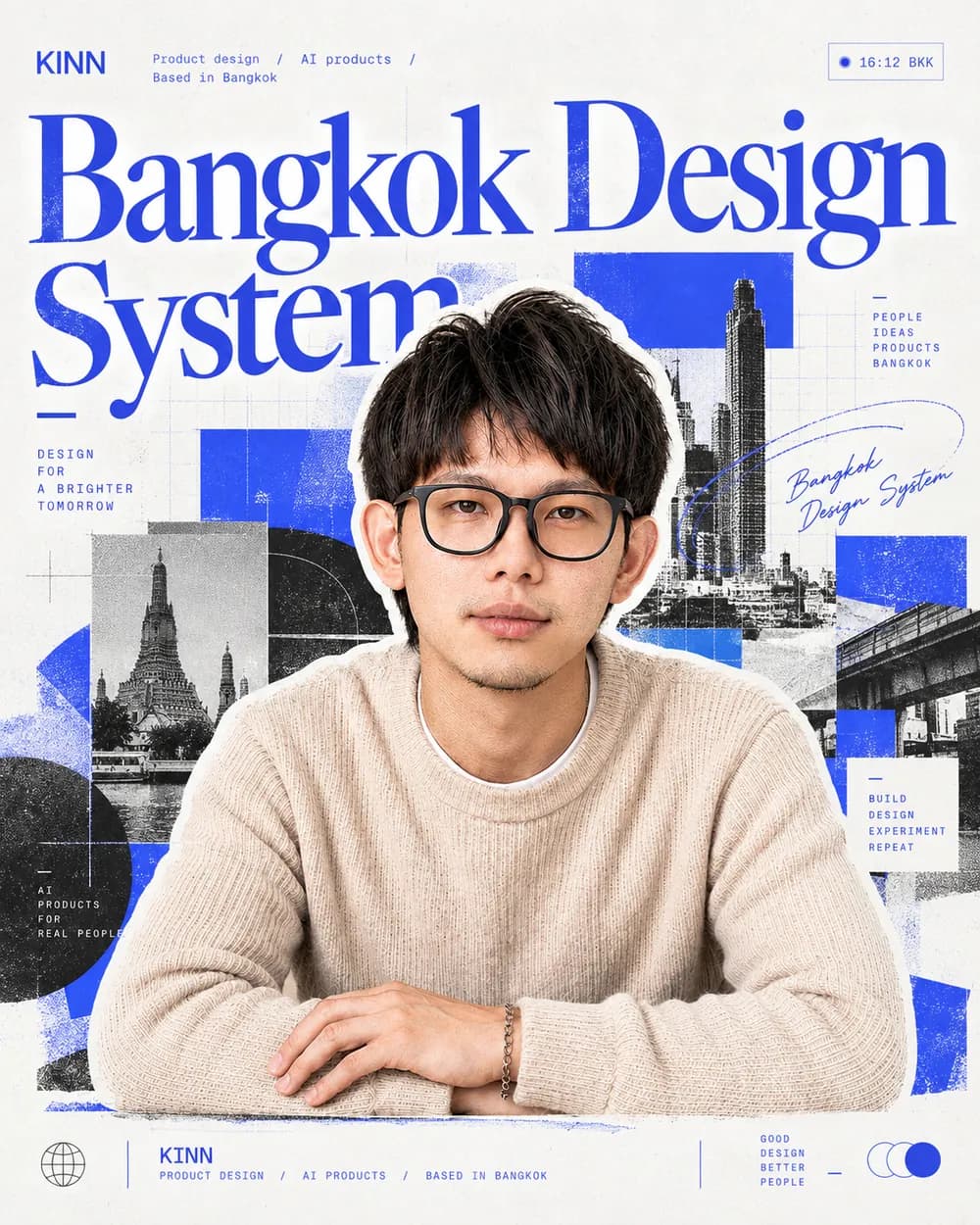
Teaching and talks
Into the AI Ocean
Session 3 at the UXmm bootcamp, on scaling design systems with AI, and how to keep a system consistent when AI writes a big part of your UI.
Components / Rows, tiles and inputs
Case row (home), cell grid (beliefs, builds, off screen), portrait tile and the hero ask bar.
LiveBangkok Design SystemCode-first design system
- Grayscale first
Color only when it means something: action, status, AI.
- Design lives in code
If it isn't in the build, it isn't done.
- One source of truth
Tokens, components and rules shared by people and AI.
- Start from zero
The first screen becomes the foundation for every screen after it.
- Gaming
Mobile Legends and PC games with my GameSir controller.
- Training
Push, pull, legs. The gym is where I reset.
- Sugar gliders
Two tiny roommates who run the house at night.
- Color grading
Editing travel photos in Lightroom and building my own presets.
K
Components / Stage
The home demo. Tabs auto-cycle; hover, focus or reduced motion stops it.
- Layers
- ▾ 01 Home
- Header
- ▾ PointsCard
- Tier badge
- Points
- Progress
- QR row
- QuickActions
- TabBar
MEMBER CARDGOLD
2,450 points
550 pts to Platinum
PointsCard
- Direction
- ↓ Vertical
- Gap
- 20
- Padding
- 22
- Radius
- 28